
April 2025
Works
Brand Visual Identity Design
Modular Bar; a Space that Adapts, an Identity that Moves
A Coffee Bar Built to Be Rearranged
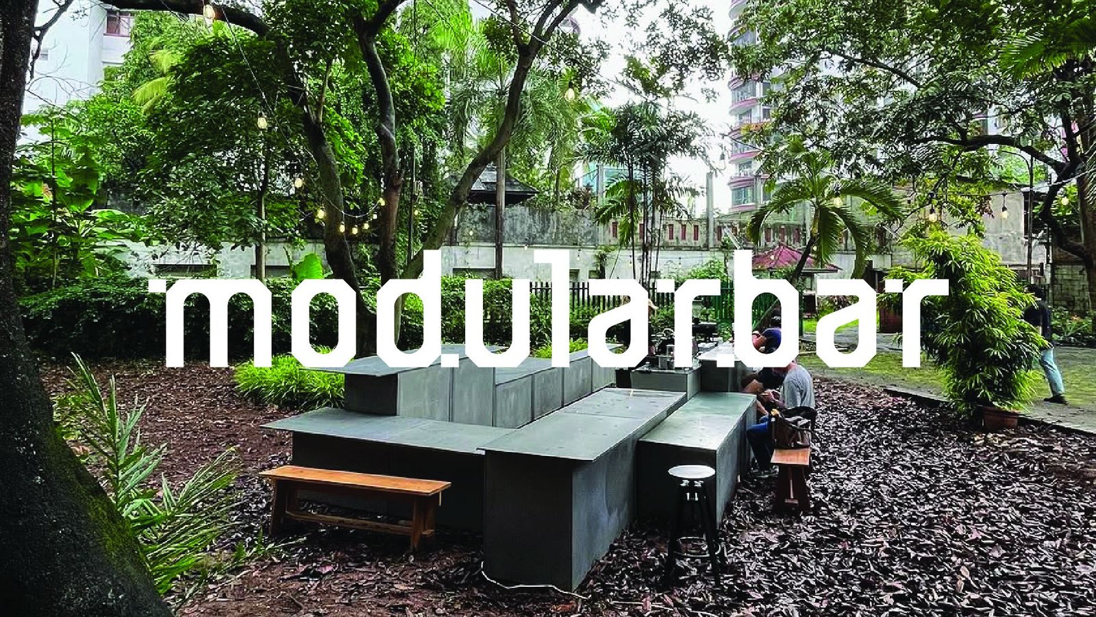
Modular Bar is a coffee bar made of separate units: compact, metal, and designed to be taken apart and put back together. An initiative by Smiljan and designed by SPOA Architect, it sets up in open fields, city corners, pop-ups and exhibitions, and reshapes itself for every place it lands.
We were asked to revise its logotype and build a visual identity that moves the way the bar does. The answer became a system rather than a single mark: one word, ten letters, six modules, and a set of rules for how they break apart, travel and come back together.
Externally — or — inwardly: the material form and the emotional form meet in one shape.
Externally — or — Inwardly
Wassily Kandinsky wrote that every phenomenon can be experienced in two ways: from the outside, through its surface, shape and colour, or from within, through what it leaves behind. Modular Bar lives on both sides. The structures you see assemble and shift, but what stays with people is warmth, conversation, and the rhythm of moving through a space.
The emotion is not broadcast, it’s evoked.
Externally — or — Inwardly
Wassily Kandinsky wrote that every phenomenon can be experienced in two ways: from the outside, through its surface, shape and colour, or from within, through what it leaves behind. Modular Bar lives on both sides. The structures you see assemble and shift, but what stays with people is warmth, conversation, and the rhythm of moving through a space.
The emotion is not broadcast, it’s evoked.
The Brandmark
Adaptive Modules
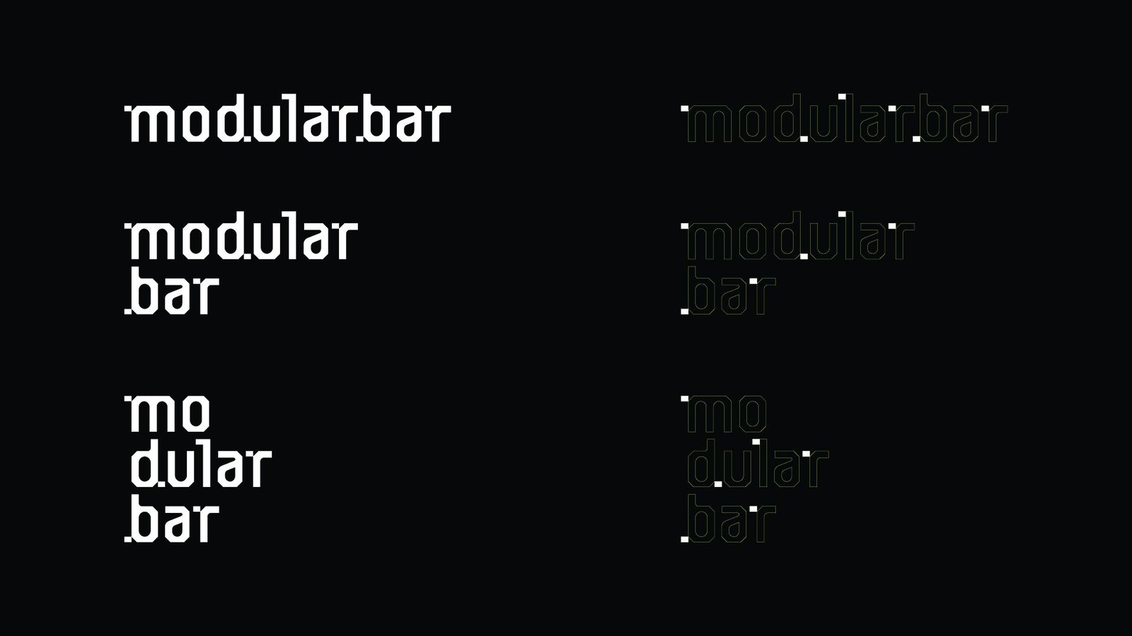
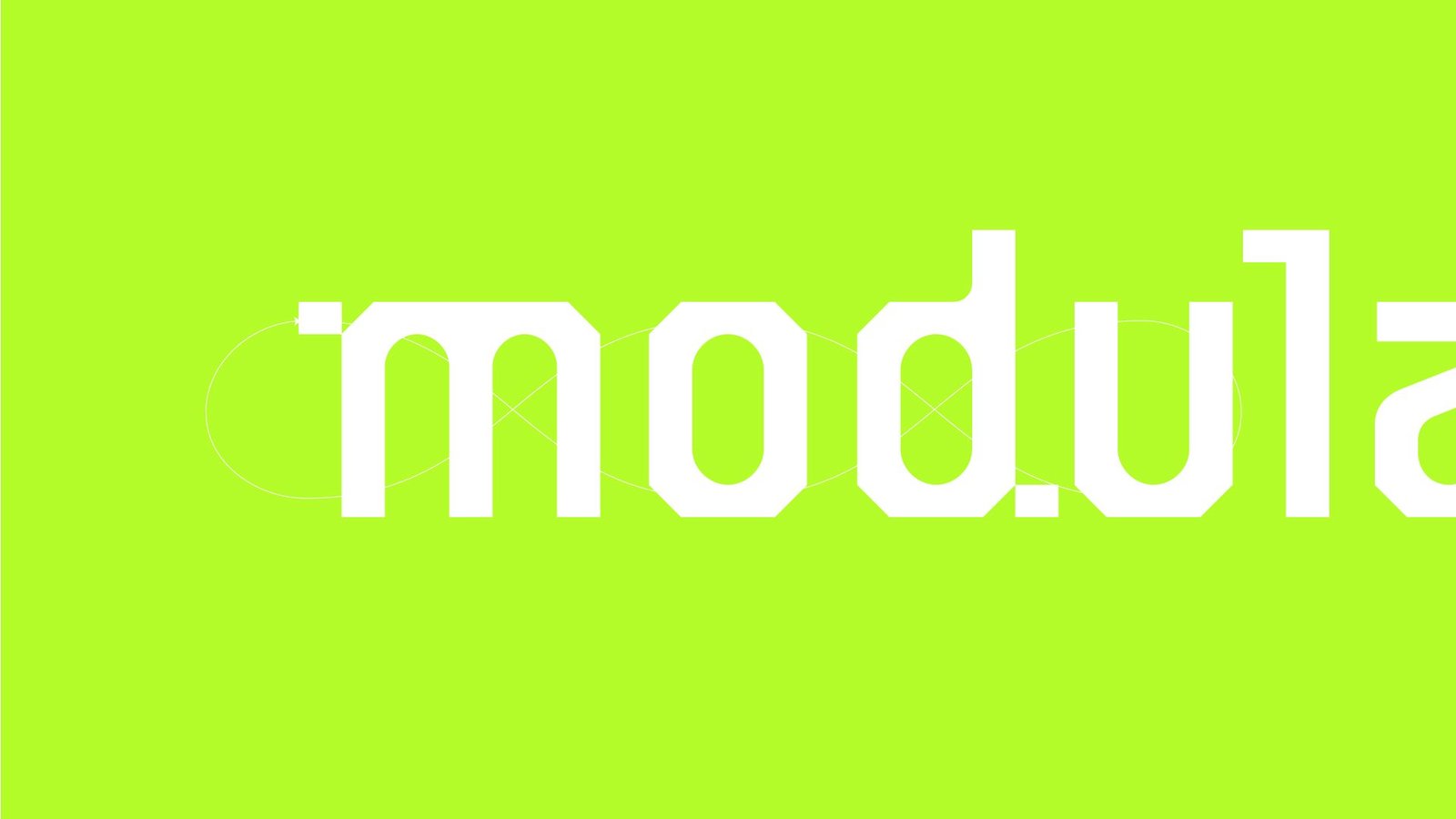
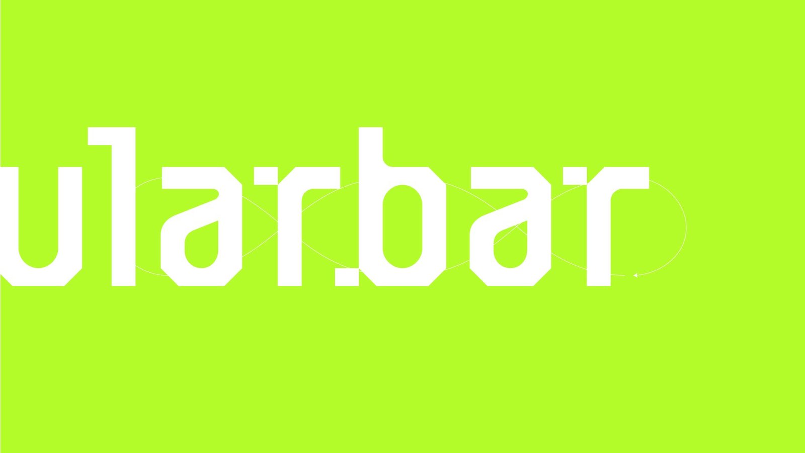
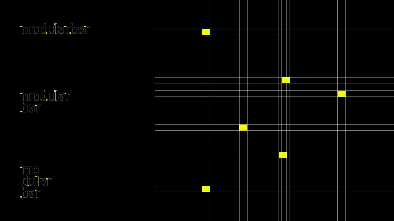
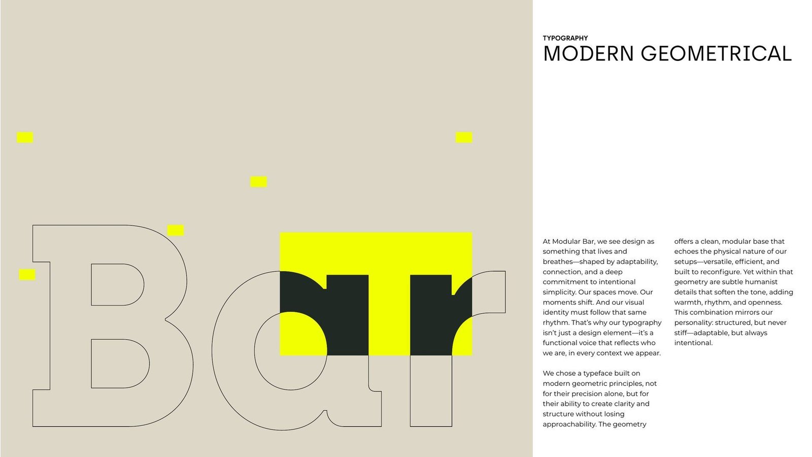
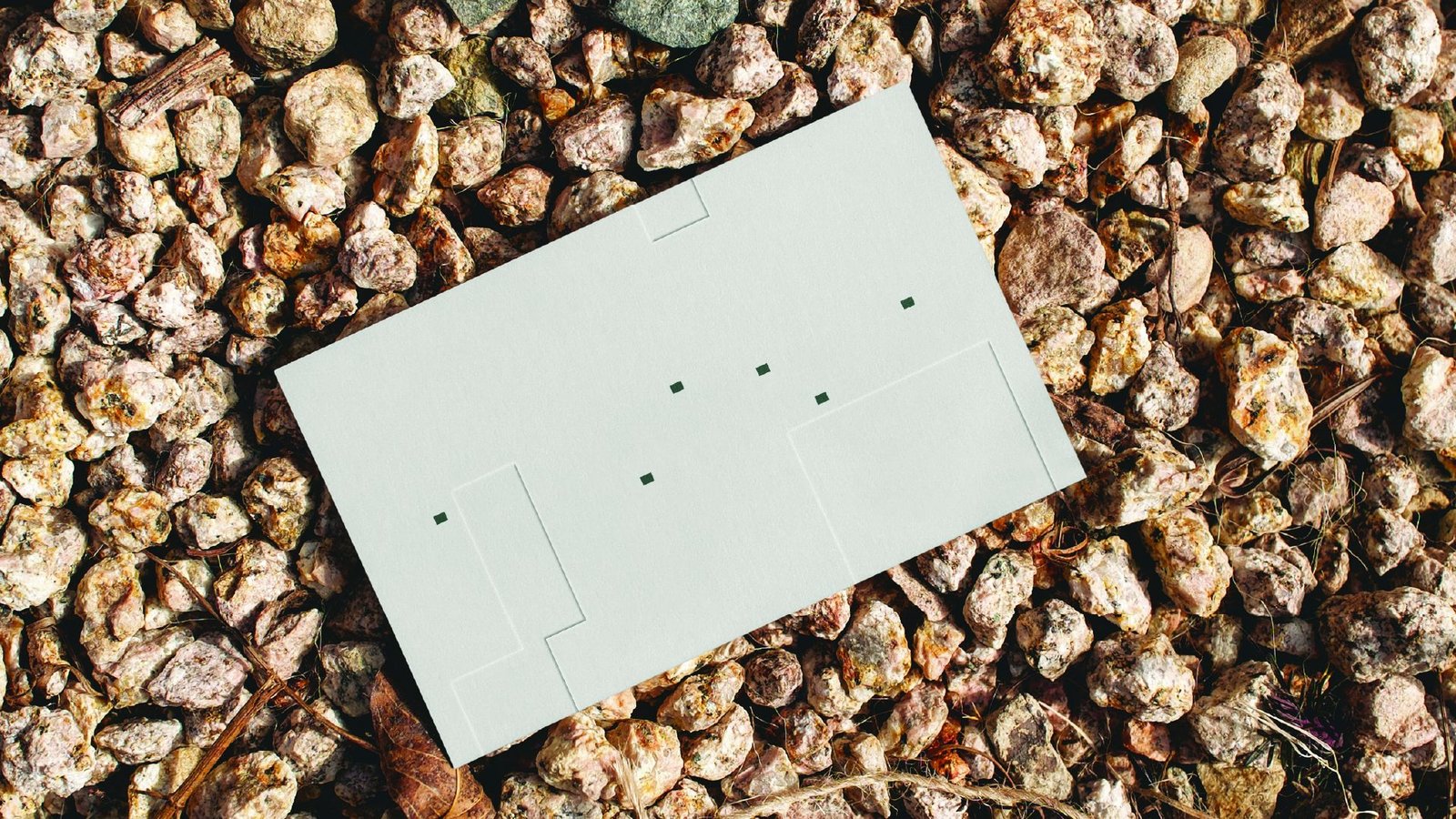
The logotype is built on one module: a stem 22.8 units wide and a small 4:3 block that hangs outside the letters. Six of these blocks sit on the m, d, l, r, b and r. They mark where the word may break (mo · du · lar · bar), and they are the anchors every lockup is built from.
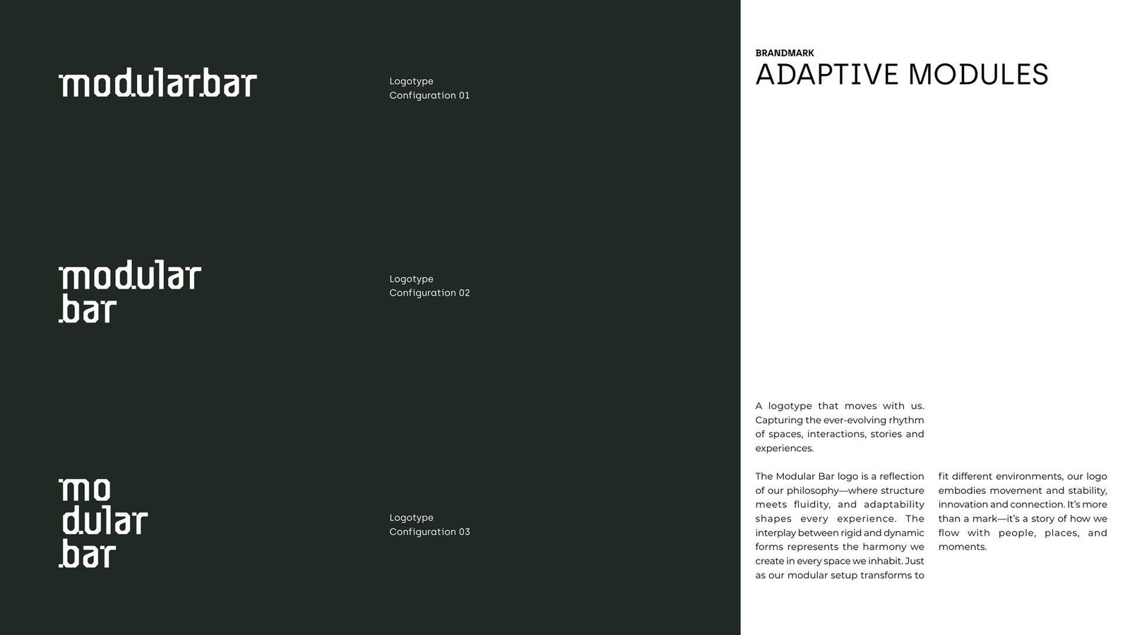
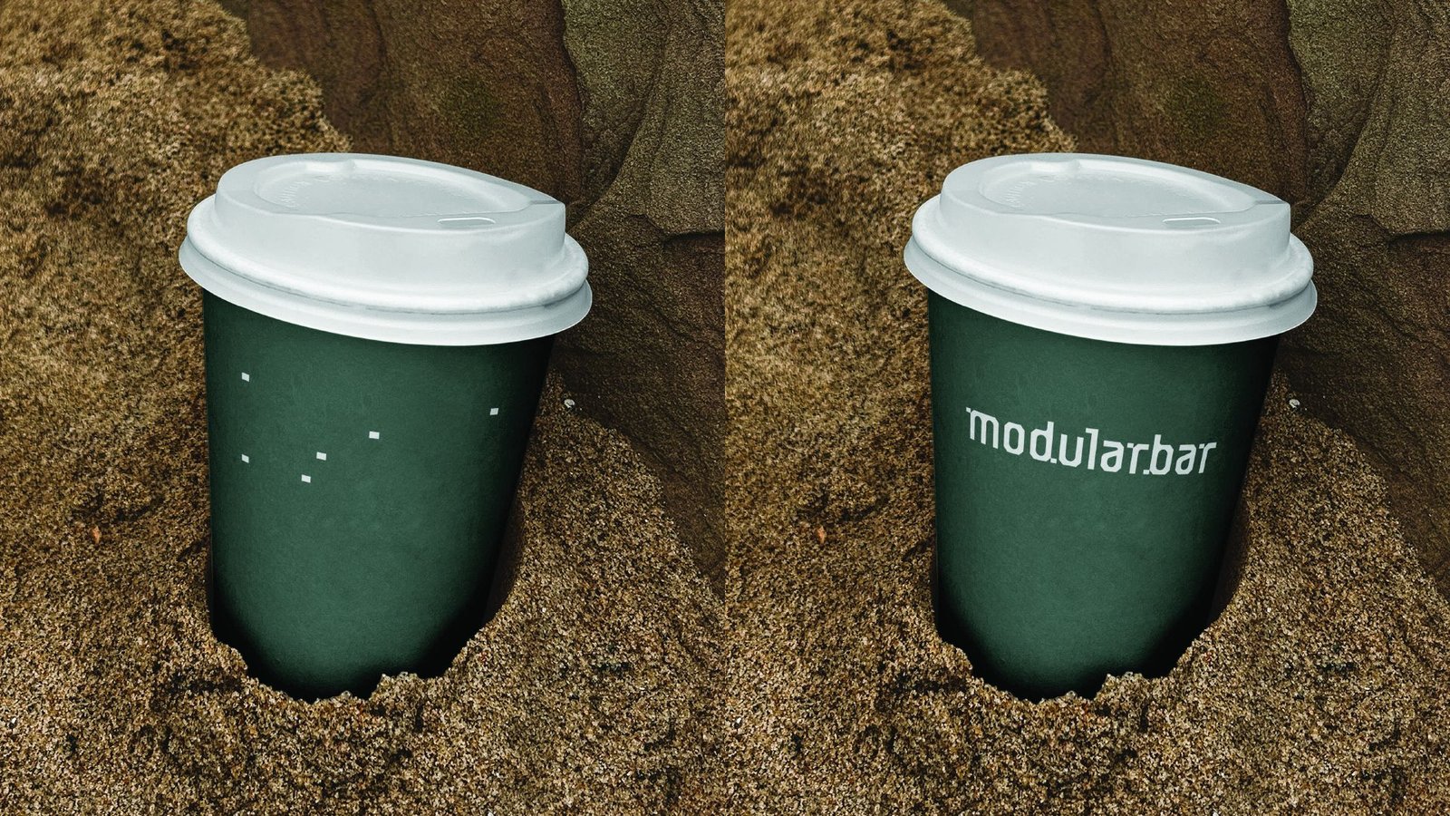
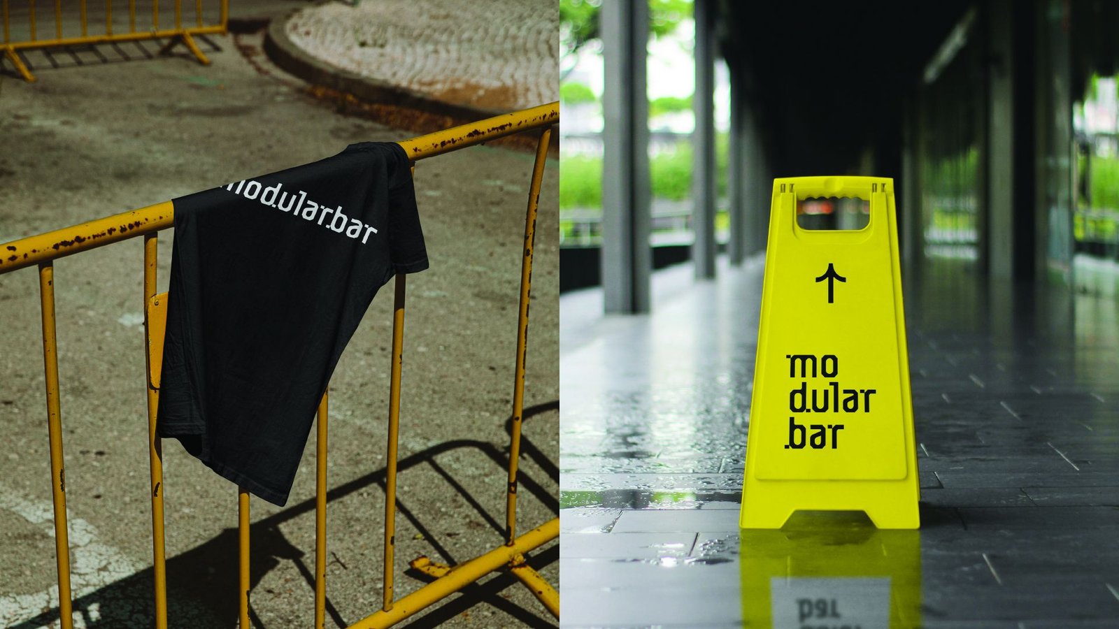
Three official configurations, on one, two or three lines, let the mark fit a bar front, a cup lid or a narrow sign without losing itself.
The Brandmark
Adaptive Modules
The logotype is built on one module: a stem 22.8 units wide and a small 4:3 block that hangs outside the letters. Six of these blocks sit on the m, d, l, r, b and r. They mark where the word may break (mo · du · lar · bar), and they are the anchors every lockup is built from.
Three official configurations, on one, two or three lines, let the mark fit a bar front, a cup lid or a narrow sign without losing itself.
The Lockup Engine
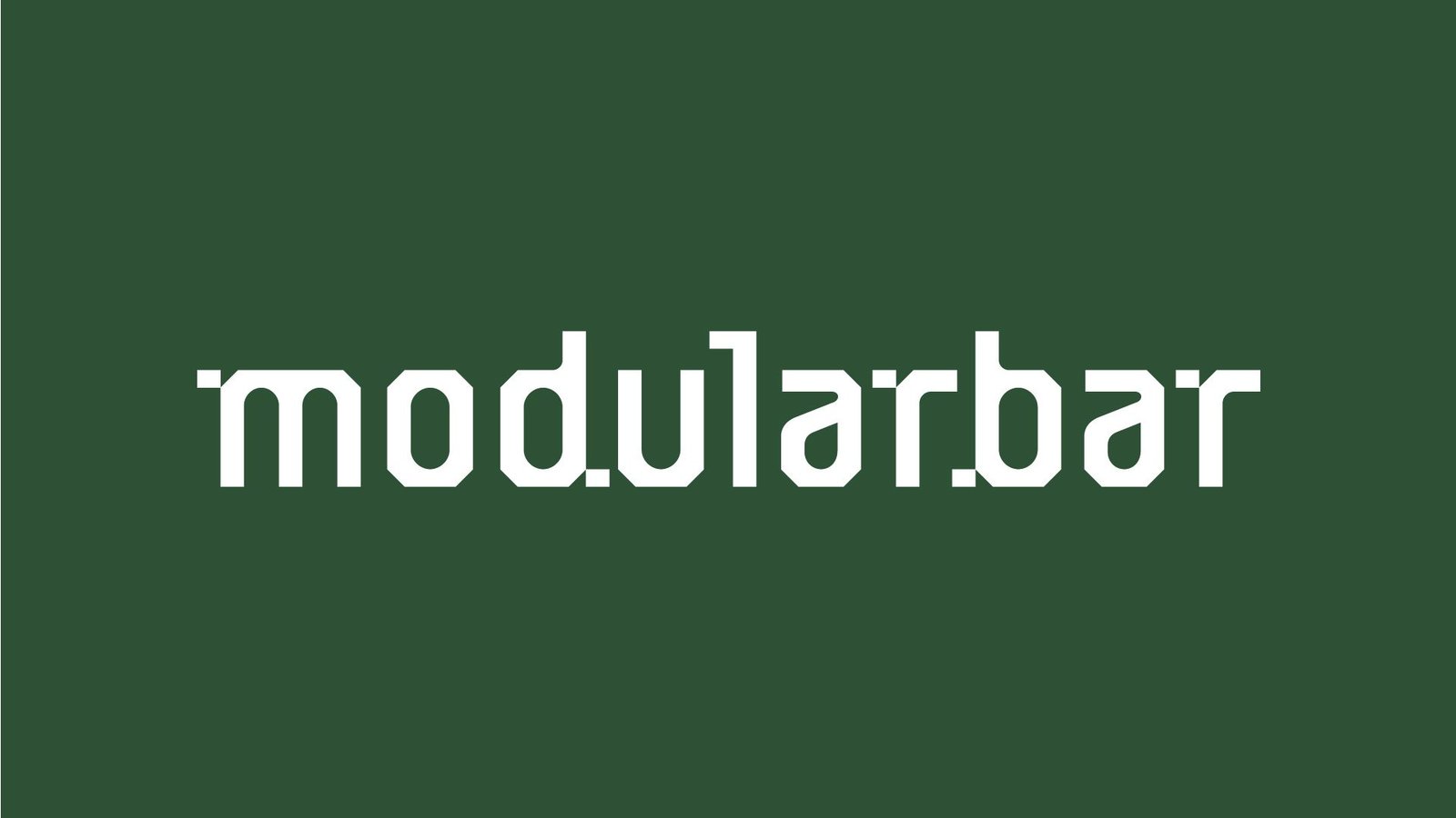
To keep the motion as modular as the mark, we built a small tool that moves the logotype between lockups along its own anchor points. Each letter is pulled back into its module, the modules travel along the grid one by one, and the letters are drawn again along their stems.
A logotype that moves with us.
The Design Direction
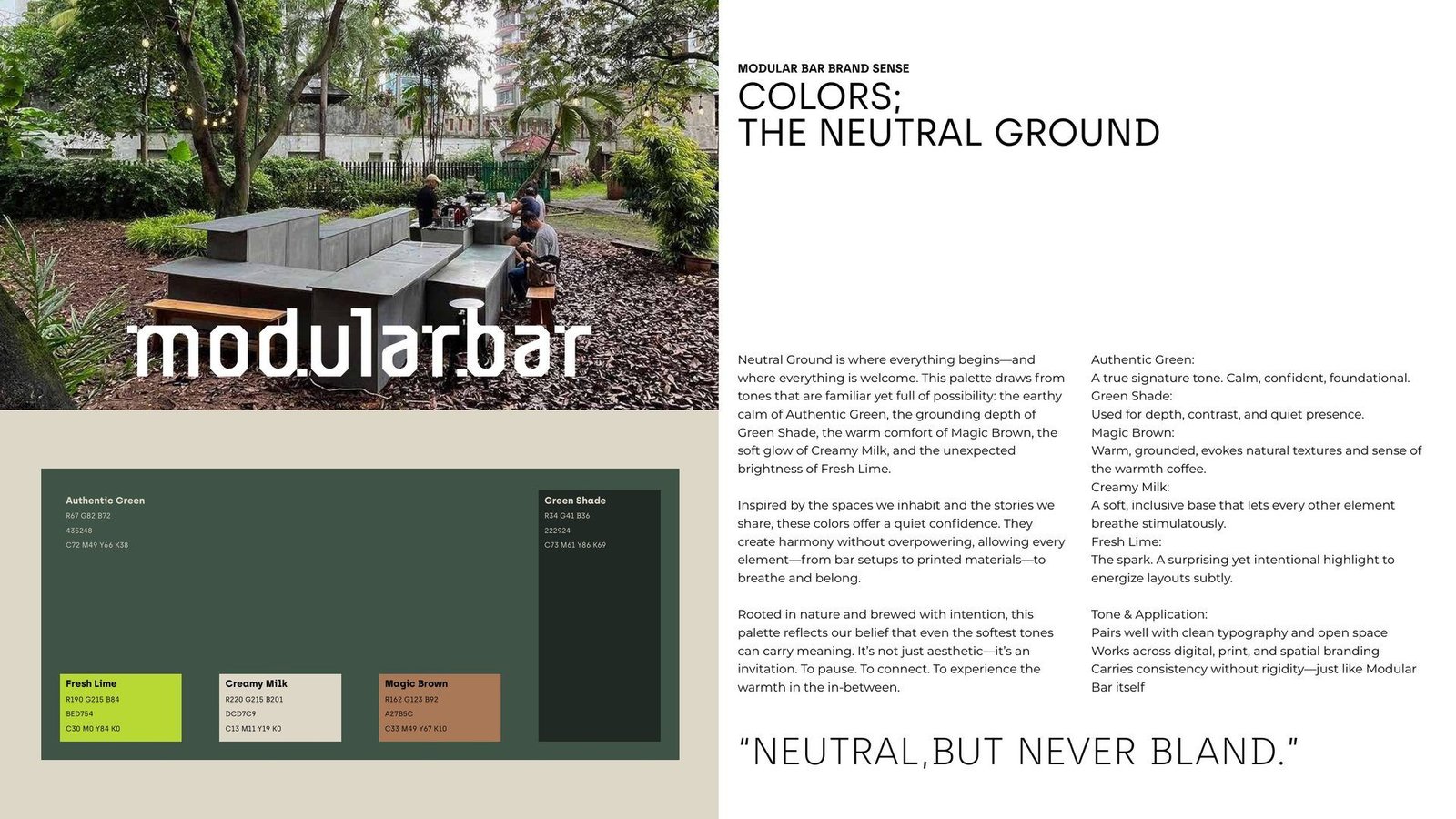
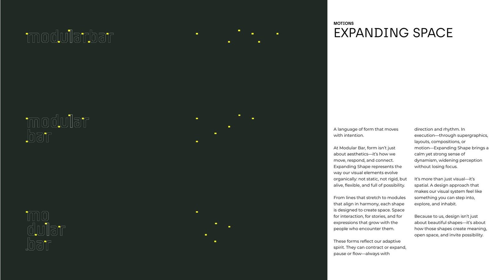
The palette, The Neutral Ground, draws on Authentic Green, Green Shade, a warm Magic Brown, Creamy Milk, and one spark of Fresh Lime. Typography pairs the modern geometry of Archia with Montserrat for longer reading. Motion follows a single idea, Expanding Space: modules open into fields, frames and text blocks, then fold back into a single dot.
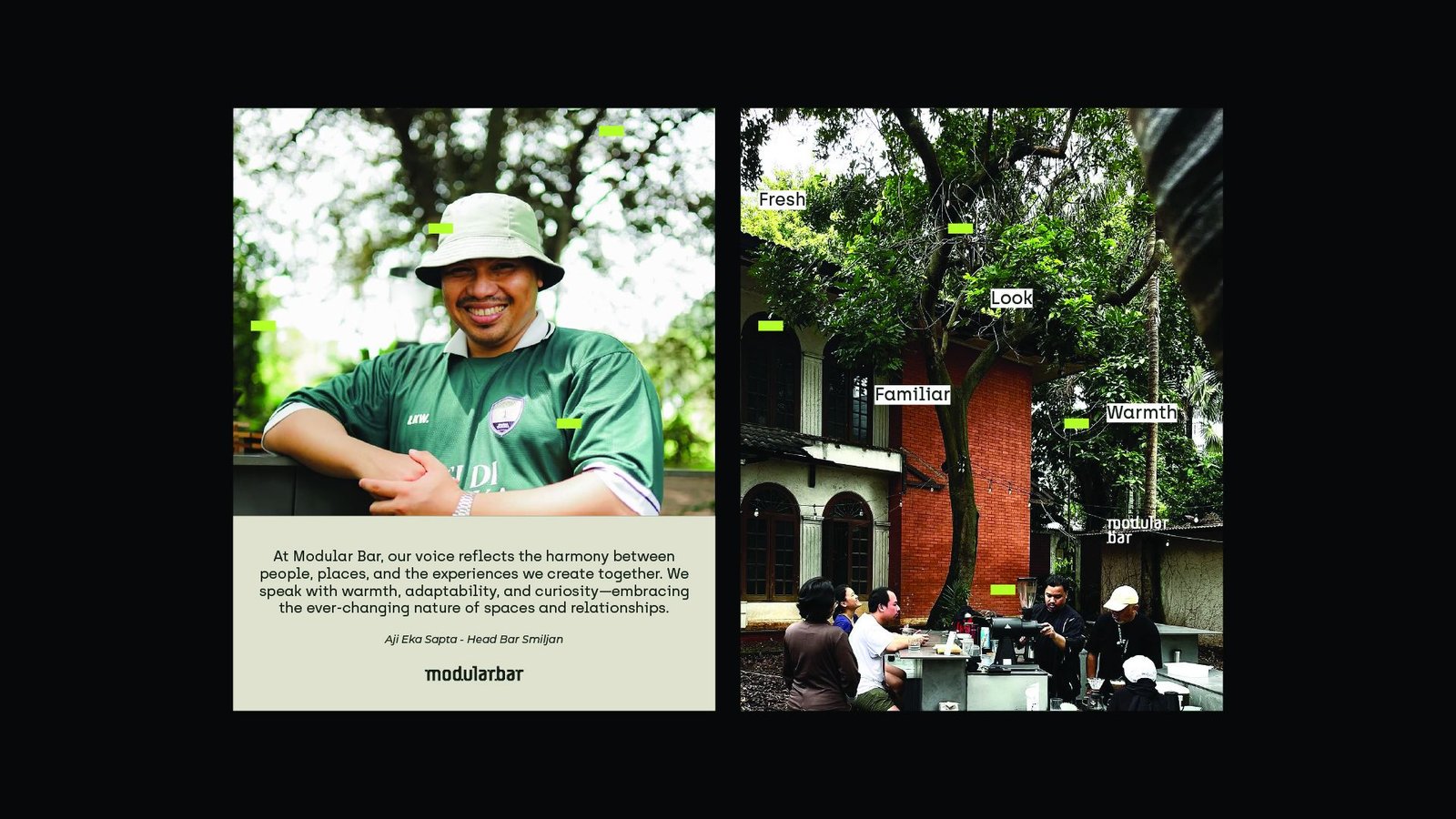
Neutral, but Never Bland
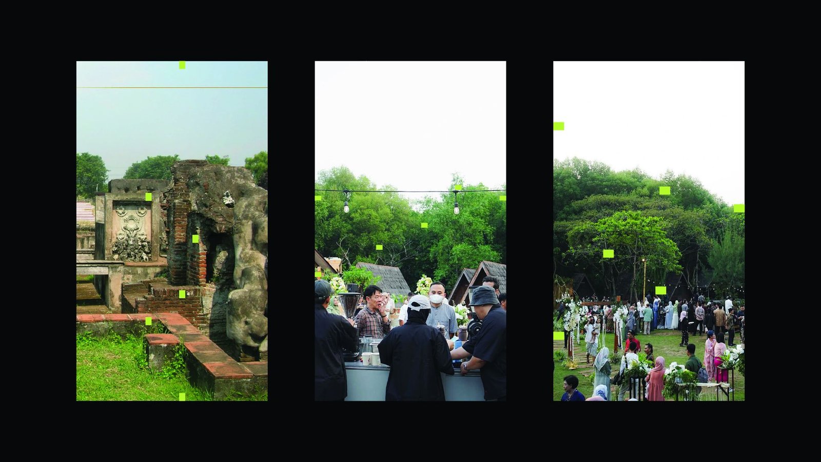
In the Space
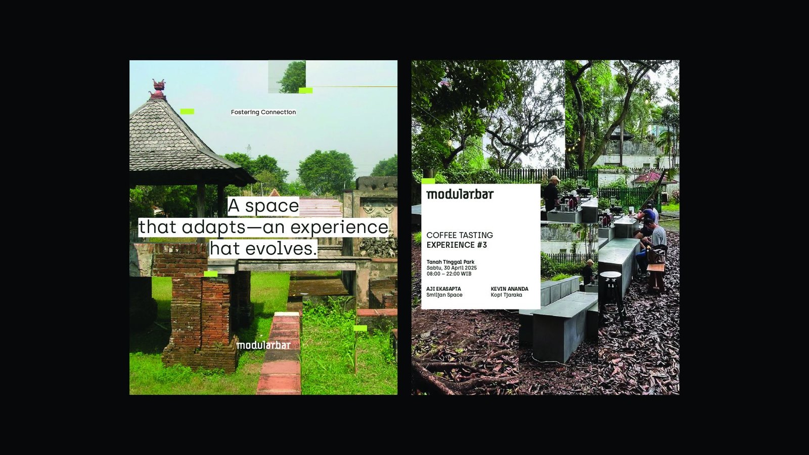
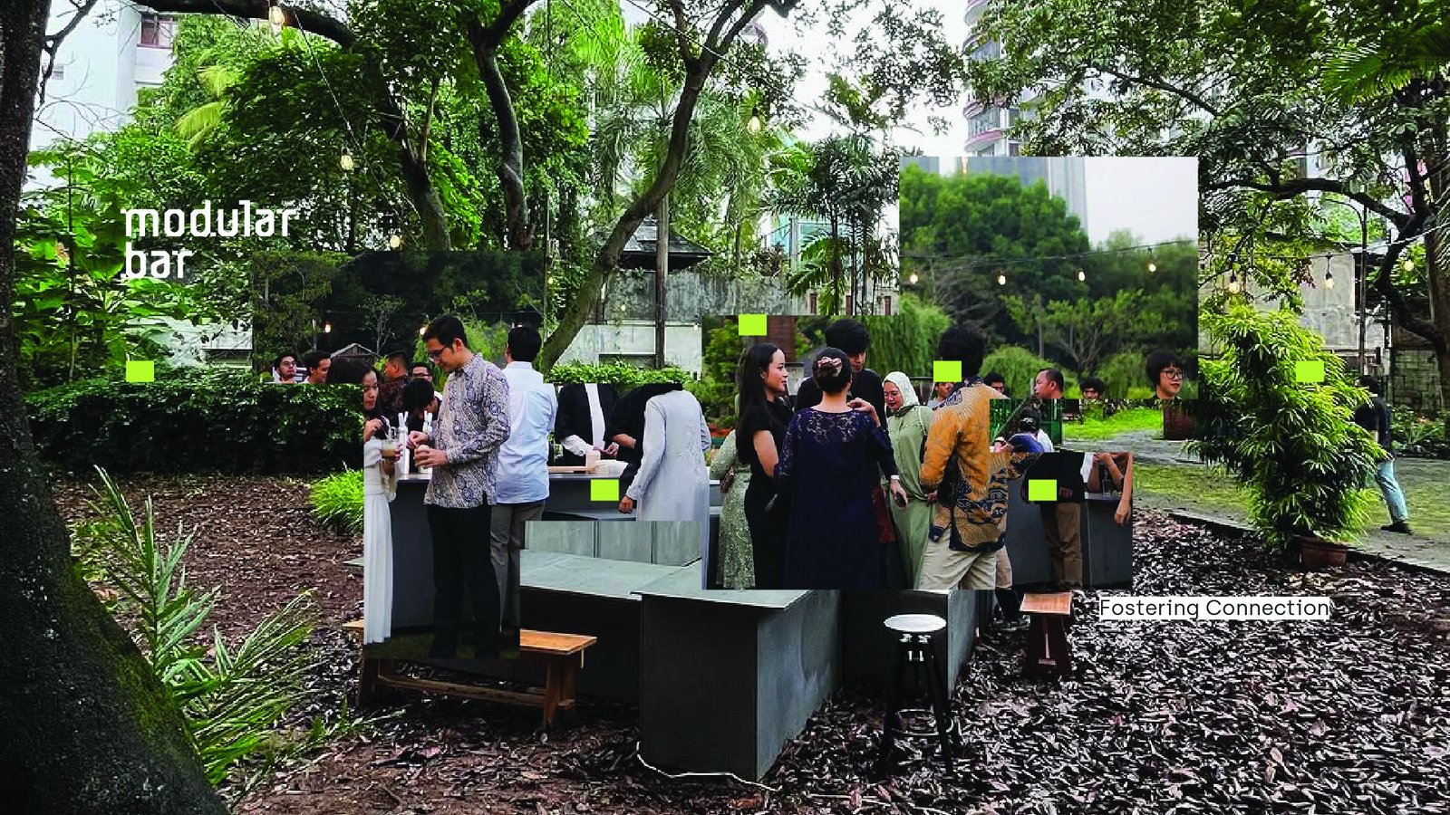
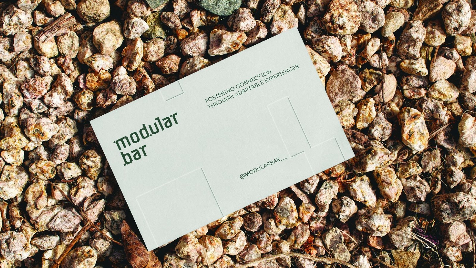
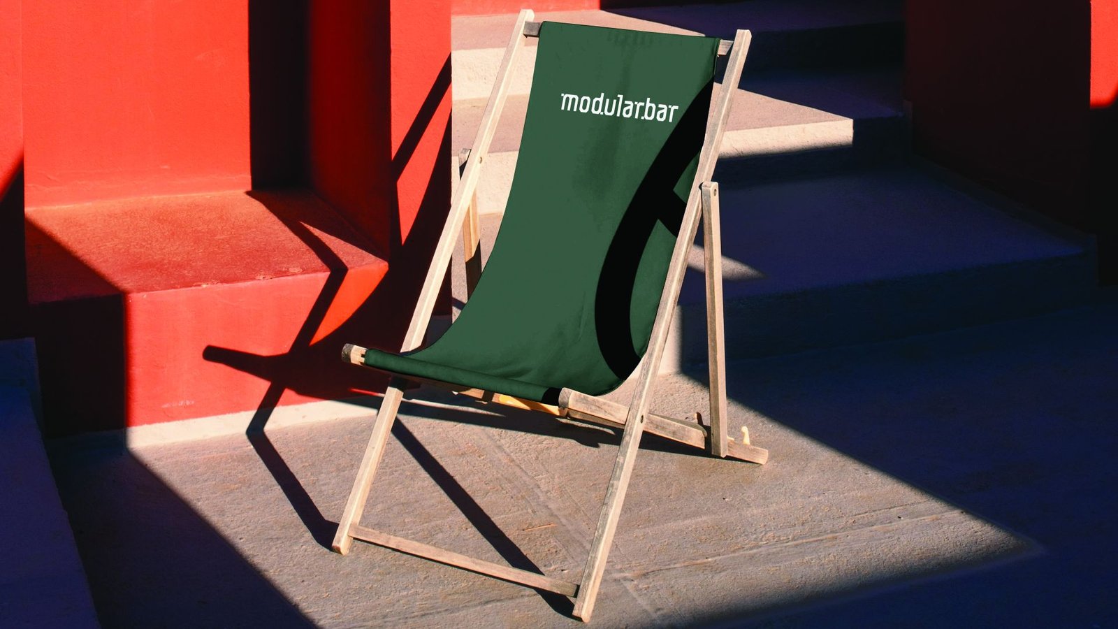
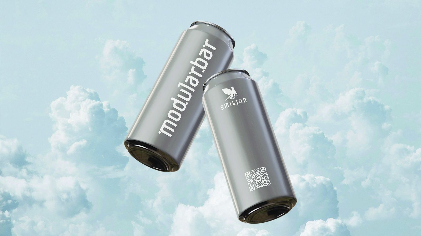
Photography tells the story moment to moment, with the bar in a garden, a barista mid-pour, and people gathered around the units. The identity follows the bar from signage and cards to cups, cans, a deck chair and a wet-floor sign, so the bar is still recognisable however it is set up.
A space that adapts, an experience that evolves.
Client — Modular Bar, an initiative by Smiljan & SPOA Architect
Creative Director — Izhar Fathurrohim Wijaya
Art Director — Akbar Rokhmanto
Graphic & Motion Design — Nugi Maulana Nurzahid, Izhar Fathurrohim Wijaya
Selected Works

Truenorth, a Local Sandwich DealerBrand Visual Identity Design

Aruna SansTypeface Design

Narasi's Custom TypefaceTypeface Design

